
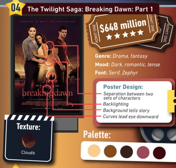
You aren't supposed to judge a book by its cover, but what about a movie by its poster?
Colour Lovers, a design blog, examined the posters of 2011's 10 highest grossing movies to see what design elements lured the masses into the theater.
From displaying warm versus cool colors, to using photos versus illustrations, there's a science to what makes these posters work.
For instance, a sans serif typeface in all caps—LIKE THIS!—was used by the vast majority of the top films.
Even though movie art isn't the be all and end all deciding factor for what makes a movie do well in theaters—many of the films were sequels and could therefore piggyback on past successes—there are some interesting lessons to be learned.
See more awesome movie posters here at Business Insider.
via @KStewAngel
--twilightish.com~Robstenfan
0 comments:
Post a Comment